Like I’ve mentioned before, I’m working on getting a design together for a personal business card. I didn’t realize how hard it was designing a card for yourself. I’ve designed cards for other people and companies (I’m not a designer by trade), but it’s been a bit of a process designing one for myself.
Like I mentioned in my previous post, I was trying to find three words that described me and would sell me on a business card. I was going to use Geek, Blogger, and left the third one up to my readership. I wanted a simple design that incorporated those three words. So here’s what I came up with, based on comments from before. This will be a full-bleed, full color card, and the front and back are below.
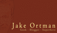

I used Adobe’s fun little tool to find a color palette, and that is a subtle watermark of my ugly mug on the card (didn’t want to put a full obvious picture on there and scare the crap out of people).
Thoughts, criticism? I haven’t printed them yet, so thoughts are welcome. Whatever I decide on will become a basis for a design that will get incorporated at some point at my personal site.
Comments
Well, the cards look better than your personal site.
I guess I’ll ask the obvious. Superhero? What super powers do you have?
Yes, I know the personal site looks like crap, but it was something that I threw up there to get something at the domain.
As for super powers, I mostly did that to get a chuckle out of people, but if you ask my daughters, they’d consider me a superhero. If you ask my boss and co-workers, and folks whose computers and data I’ve saved, they’ll tell you the same thing.
That, and I’ve performed the Heimlich maneuver on two choking victims, so that has to be worth something, right? 🙂
Just read this the other day: http://www.quicksprout.com/2007/07/31/what-does-your-business-card-say-about-you/
Yeah, saw that on digg, too, Jeff — the problem with some of that (like the rounded corners and such and the paper choice) is that I’m getting these for free, based on their normal color cards — any changes will cost extra.
I really like the card. Nice touch with the watermark. Only thing: “Superhero” is so overused and says really nothing. Instead of just “Geek” what about (going from your description to the left) “Jack-of-all-trades Computer Geek” and then just “Blogger”. That way, you kind of cover it all in the non-defining “Jack-of-all” title. Make sense?
What about Jake-of-all-trades ?
I agree. Superhero, al-be-it funny, may not adequately define. And of course, Domestic Goddess is already taken.
And snork at Jake of all trades.
Hey, yours is the same number that they use on TV!
Jake,
I would right align the headings, cell, home, e-mail, etc. that would get rid of that odd space.
This is not a personal card, but this is the design I went with: http://www.meancode.com/temp/me/meancode.biz.front.final.gif
And yea, change those numbers before you get 1000 printed 😛
Not a fan of Superhero, but don’t really have a suggestion for what to put in place of it.
Hi Jake, its not bad, the watermark picture could be a nice effect if your color builds are good for the printing process your using. If you have an RGB file being converted to CMYK on the fly by the Printer�s RIP you might get some unsatisfactory results on the finished card. The problem occurs when dealing with the different behaviors of Additive Color (Computer monitor) and Subractive color (Analog Printed Paper).
Adobe (the maker of some of the best professional desktop publishing & photo editing software on the market) has been making their tools default more to web (Additive color) use over print production (subtractive color). They are optimizing the default setting of their applications for screen and web preview burring the options need for quality print in the UI hidden away from the enthusiastic less experienced user. This makes it more difficult for the user to accurately control the color of the final printed piece.
Some colors built in RGB (Additive color mixing) especially greens and blues can have major issues (i.e. greens looking dead or grey) when converted to CMYK (Subtractive color mixing). Your design should be ok with the redish brown. Red will be red however its still is something to keep in mind (i.e. it might drift from a burgundy red to a cranberry red). Some printers use color management software to help minimize these potential problems but I find that most printers don�t have a clue how to use Color Management effectively or they just don�t care. For the most part they do not understand the physiological and psychological effects that slight differences in color can have on the viewer. One red may be warm and comforting sense while the other similar red creates a sense of aggression and tension so even subtle differences can have a huge impact in the effectiveness of the design.
If you plan to use an online printer I would recommend you stay clear of Vista Print unless you are really hurting for money and don�t care if you have a cheap looking / feeling card. There is a new company specializing in business cards and postcards out there call Bizcard.com I have done a lot of work with them in the past few months, they have no upload fee�s and they produce a good quality product on quality paper, they have a color managed workflow so if you don�t know if your are files set-up correctly for print their system detects this and automatically converts the for CMYK printing (Subtractive color) and shows you a PDF preview of your uploaded design with the color simulated as it would look when printed in CMYK on their press so you know what it is going to look like (good or bad) before you execute the order. They keep adding new feature like every couple of weeks & I know they were talking about adding a lot more paper options and rounded corners in the future maybe they have those features now.
As far as super hero goes, drop it. I get what your trying to do, but geek alone does the same thing without being too cheesy. Geek is fun and yet it says a lot. Super Hero is a bit much unless your just trying to impress those who you already know and already do business with. Cold Call contacts might look at Super Hero and question your professionalism.
I work for a small company called American Business Card. For over 15 years I have been designing all kinds of business cards, and stationary, webpages and other marketing solutions for the medical industry. I also freelance and work as an independent print production quality assurance consultant and color management specialist, and do some lectures on designing for production, and innovative marketing solutions from time to time.
Thanks for you input everybody! I’m thinking I’ll drop the superhero and will work with it from there. I do like the “Jake-of-all-trades Geek” and might have to steal that 🙂
I can attest to the “Superhero” part. He saved my blog!
you forgot PERCUSSIONIST and helluva guy
Huh……….. Superhero was the one thing that caught my eye and made me smile. It doesn’t make me take you less seriously, it makes me notice the card! 😛 It says, “this guy isn’t ordinary,” it made me sit up and look closer.
If we have to give up Superhero, I like Jake-of-all-Trades too. But not as much as Superhero.
I like it.. but one thing is bothering me.. “GEEK” ???
I got three words for you…
what this is family friendly? Um, never mind.
Jake, here it is. “White & Nerdy”
http://www.youtube.com/watch?v=-xEzGIuY7kw